
Who are you?
Parallel Sound* are a modern sound design company who create moving compositions for indie and small film producers.
They were struggling with having customers approach them requiring classical music composition - not understanding that they specialise more in contemporary sound design.
The root of the issue being that the current branding by Parallel Sound suggested to propective customers that they offered something that they weren't specialists in.
Because of this understanding, they tried to start turning jobs away where they didn't feel the project was suitable for them - but this led to the number of new projects dwindling, putting the business at risk.
After sending out reviews and questionaires to their customers, they discovered the reason behind why they weren't getting the 'right' projects - their image.
The old Parallel Sound logo suggested and portrayed a business that composed classical music, and wasn't the modern and contemporary sound design company that they are. They decided that in order to properly serve their customers, the right customer had to be able to find them.
The new look
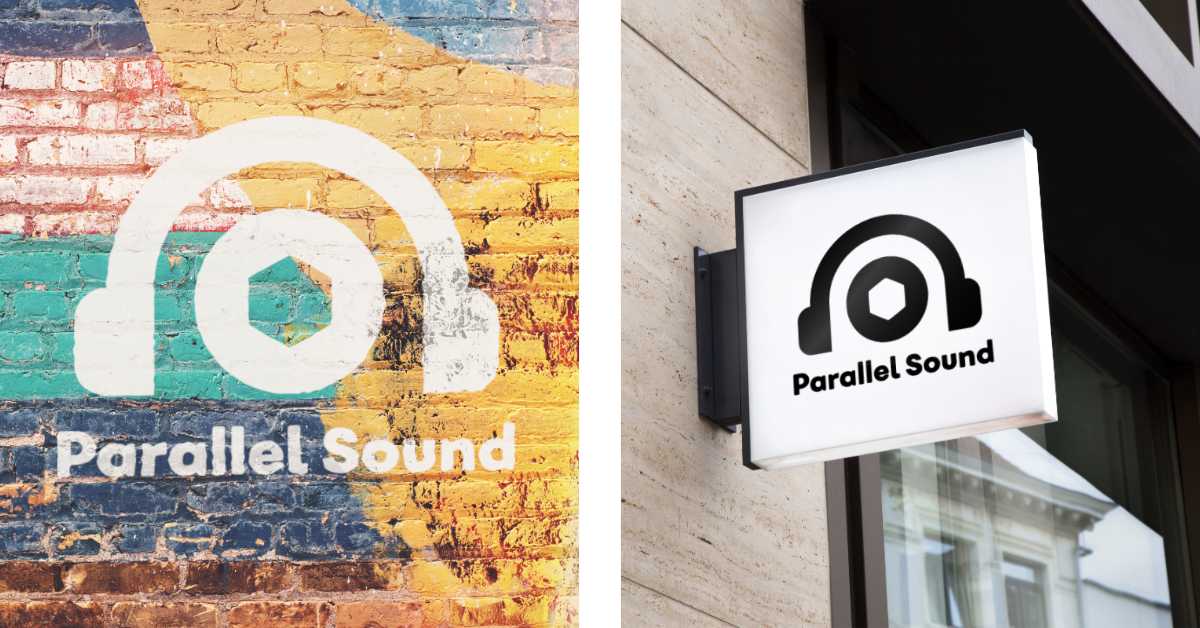
With their new brand image, there is no mistake that that Parallel Sound don't specialise in classical music, but are a modern, trendy company and group of like minded sound designers. New customers love the new look and how it reflects the companies beliefs, mood and personality.
Now, the right kind of customers are finding them, customers are happier and business is growing because of it!
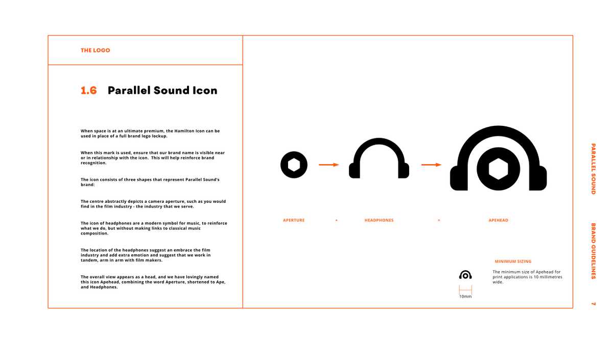
The logo itself is not 'just' anything - it is built with meaning that reflects the companies moods and beliefs but also connects specifically with their target customers.
The central area of the logo represents an aperture, like that you would find in a film camera.
The headphones represent the modern music capabilities of Parallel Sound - a symbol of music of today and the future but not of the past.
The combination of these elements represent Parallel Sound embracing the film industry, supporting it and making it more than it is.
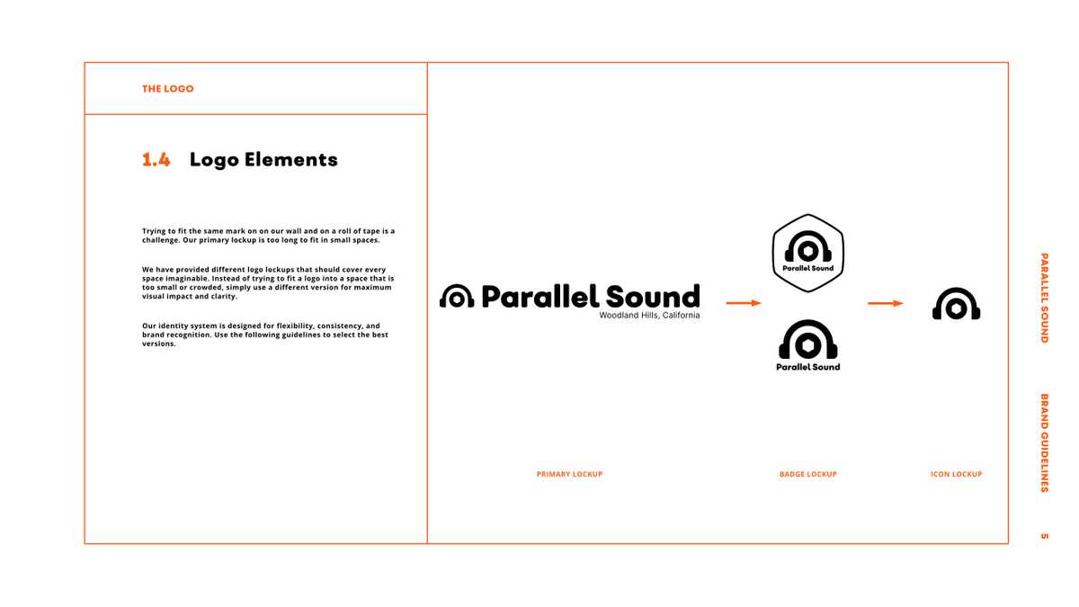
The logo itself is designed to be versatile. There are multiple configurations of the design, to be used in specific situations, depending on medium, background, colour, contrast and space. A Brand style guide was created in order to help the in-house marketing team use their own logo correctly and consistently.

With a logo, Parallel Sound were able to reinstate their position in the industry, and attract more of the right types of projects.
*Although all of the work here is real and created by me, Parallel Sound as shown here are a fictional company and therefore any similarities of links to actual companies or individuals should not be made.