The Brief - The Solution - Additional Images
Brief
Any branding shown by the project on this page has been produced by me purely to adhere to the requirements for this project set for me by Bournemouth University. There is no official affiliation between this project and any brand or registered trademark.
My first individual project at University, set with the tasks of choosing and researching an existing brand, then generating concepts for a 100ml container to fit in with the brands current line of products.
After generating concepts, I then had to choose a final design, model it in Solidworks, and create a presentation board to display the design. Finally, I had to model a prototype of the bottle by hand - no 3D printing allowed.
The Solution
Having chosen Original Source as my brand and a hand sanitiser as the product, I set about researching current and previous marketing materials and physical product forms. After gathering this information, I created a 'mood board' to reference during the concept and detailed design phases.
I wanted to maintain as much of the original, and strong, iconic brand identity as I could, so that my design would fit in seamlessly with the current range. In order to do this, I analysed and measured the current design at the time (2012), and worked out the ratios used to create the iconic, almost chamfered design; I then applied this ratio to my design.
As I was designing a smaller, 100ml capacity bottle, I wanted the design to be as ergonomic and comfortable as possible to hold in one hand, and provide grip. I did this in two ways, to provide grip, I included the texture that was used in the current design, which was added to provide grip when using the bottle in water (bath/shower). After designing in the chamfered shape, I then created a curve in the bottle, with the idea that it would almost wrap around the users hand when being used, to make easier single handed use.
When the design was finalised, I started on creating my presentation board. The board went through multiple iterations, not only to refine the quality and composition of the design, but also to hone my own presentation and Photoshop skills. I referred back to my original mood board, showing previous marketing content by the brand, in order to take inspiration and try to fit their identity.
Finally, I took to the workshop, in order to build my proof of concept prototype. My course set a number of requirements for the prototype; must use vacuum forming, no additional parts or functionality to be added, no branding to be applied.
I created the form of my bottle using mdf, building the outside shape of the design to the correct dimensions, minus the material thickness, so that after forming the bottle would be the correct size.
After forming the two halves with HIPS (High Impact Polystyrene), I bonded the two halves together and made sure to finish all edges, in order to make the prototype look and feel as though it was one part.
Additional Images
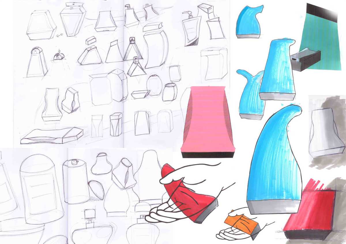
Early concept development and exploration sketches - not presentation sketches
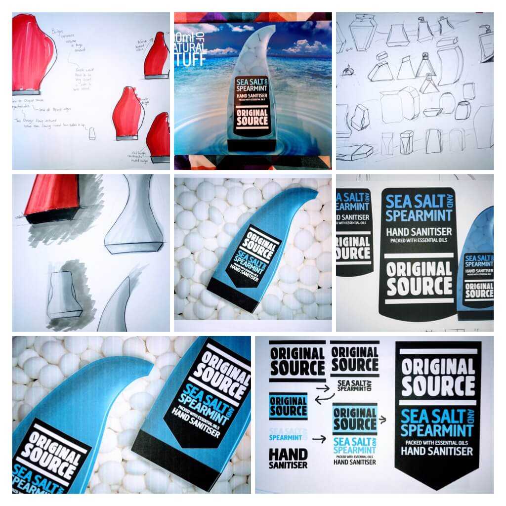
Sketching, Presentation and Branding development
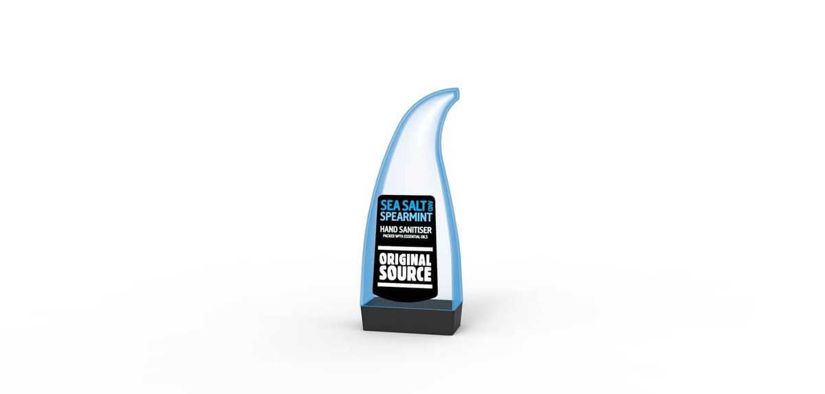
A Keyshot render of the final bottle design with branding applied
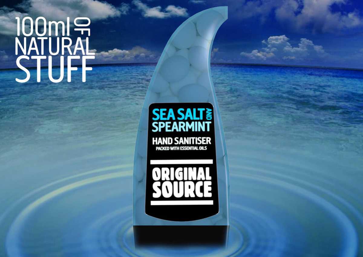
100ml Travel Bottle Presentation Board
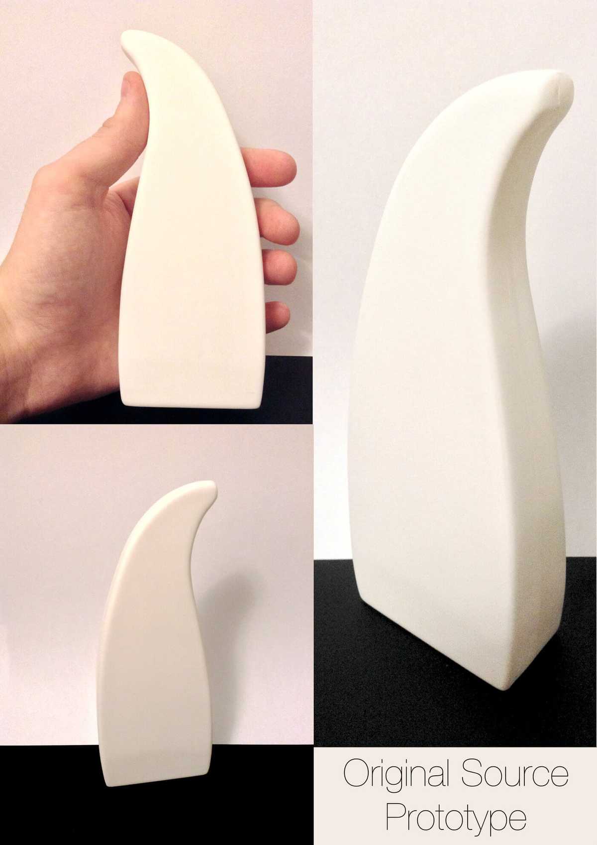
100ml Travel Bottle Prototype